


Modals
Default Modal
A default modal Example.
Vertically Centered Modal
Use modal-dialog-centered class to show
vertically center the modal.
Grids in Modals
Static Backdrop Modal
Toggle Between Modal
Tooltips and Popovers
Scrollable Modal
Varying Modal Content
Optional Sizes
Use modal-fullscreen,
modal-xl, modal-lg, or
modal-sm class to modal-dialog class to
set different size modal respectively.
Fullscreen Responsive Modals
Below mentioned modifier classes are used to show fullscreen modal as per minimum screen requirement.
Modal Positions
Use modal-dialog-right,
modal-dialog-bottom, or
modal-dialog-bottom-right class to modal-dialog
class to set modal at different positions respectively.
Custom Modals Example
Success Message
Here is an example of a sweet alert with a success message.

Login Modals
Here is an example of a sweet alert with a error message.

Subscribe Modals
Here is an example of a sweet alert with a warning message.

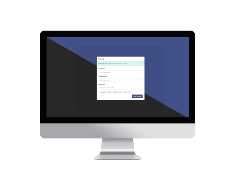
Sign Up Modals
Here is an example of a sweet alert with a community registration field.